Writer – Jason Aaron
Artist – Esad Ribic
Colours – Ive Svorcina
Part three of The Last Days of Midgard finds young Thor and old Thor facing off for the battle of the home they love – the planet Earth. The best part of this title that Aaron ever introduced was All-Father Thor. It is usually not the way of things to know the end result before taking the journey, but it is great to see Thor in his old age. Also introducing an elderly Galactus is genius. Having Galactus come back to the Earth, after everything and everyone is dead and gone to finally sate his hunger and then face off against Thor for perhaps the final time is absolutely thrilling to watch. Except when Galactus barfs. Did not really need that. But punching Thor through the Earth, to the moon and destroying it? Excellent. Also great to see current Thor up against a foe he has never faced before and one he may not possibly be able to beat. There is also a little comedic moment that is quite hilarious. The book does not often feature comedy, but is welcome when it appears. Ribic’s art is just as awesome as ever and it looks as nothing else on the stands today. Thor continues to be a fun series and if Marvel is smart about it, they will try and keep the creators in place for a long time to come.
4.5 out of 5
Writer – Joshua Hale Fialkov
Artist – Mario Guevara with Tom Grummet
Inker Juan Vlasco
Colours – Rachelle Rosenberg
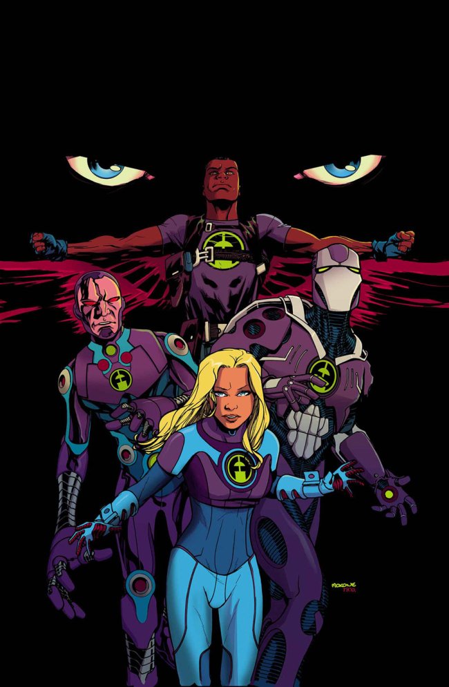
At this point in time, after 616 Galactus has been taken care of, the Ultimate version of the Future Foundation consists of Sue Storm, Iron Man, the Falcon, Machine Man and Phil Coulson. An interesting lineup from Fialkov with one member a robot, one an android/cyborg and one who is a guy in a metal suit. It is great to see Sue Storm, at least in this universe, as a team leader and really showing what she can do. Tony is just as funny here as he is in the main Marvel U and while the Falcon is an intriguing character, his costume design is terrible. The artwork by Mario Guevara with Tom Grummet is okay, but nothing spectacular and there are too many pastels in the book to really make it exciting. The FF logo is fun, not as iconic as the original 4 symbol, but it suits this new super-science team. A good setup and the reveal of a possible member at the end of the issue at least make you want to come back for the second book and give it a shot.
3.5 out of 5
Categories: Comics, Mind Capsules


